Monday, July 28, 2014

Summer squeeze part 2!

Here are just a few more layouts using this months "Use Your Stash" kit-
This page uses mostly left-overs from the previous two pages I made.
 What is it about a sunset that just make you want to take pictures?
I'm a sucker for the sunset shots.

I almost used a full sheet of vellum on this layout, completely unheard of for me!
 This was a fun page, I even used  a couple of stamps and a punch or two.
These are also great colors for my "boy" pages. Quite the bonus around here...

The final layout, once again makes use of those little left over pieces.
 I cut several small squares and then simply cut them again
(corner to corner) to make the small triangles.
 This used up even the tiniest bits of paper, but still gave the page a slightly different look.
I used sketch #324 from Nuts About Sketches for this layout.
Be sure to check them out.

Working with this kit has really been a lot of fun and a bit of a challenge.
 I have used some things that have been in my supplies for a very long time
...and that is all good!

I hope everyone is enjoying these last few days of summer...
school starts here next week. CRAZY, right?

Thanks so much for stopping by!!!


Sunday, July 20, 2014

Scrap Stash Layouts

This week I have been inspired by the fabulous Margarita 
over at Use Your Stash, to make my own kit.
I loved the bright colors and have been happily scrapping away all week.

Here are a couple of layouts I made with the kit I created-

The idea is to use up those older products that we all just had to have.
The orange brads on this first page are at least 6 years old.
They look much better on a layout than they did in my brad tin.

I created this layout using mostly scraps from the first page.
I added a few things, including the large flair badge, I bought ages ago.

I really love the concept of "shopping your stash" and creating kits and layouts from things you already have on hand.
 We bought it, we must have loved it, right?

Head on over to Use Your Stash and check out all the inspiration!

Thanks for stopping by!


Tuesday, July 15, 2014

Long time - no blog....

I know right?

In my defense, I spent the last week at the beach with my family,
and I'm playing a little bit of catch up this week.

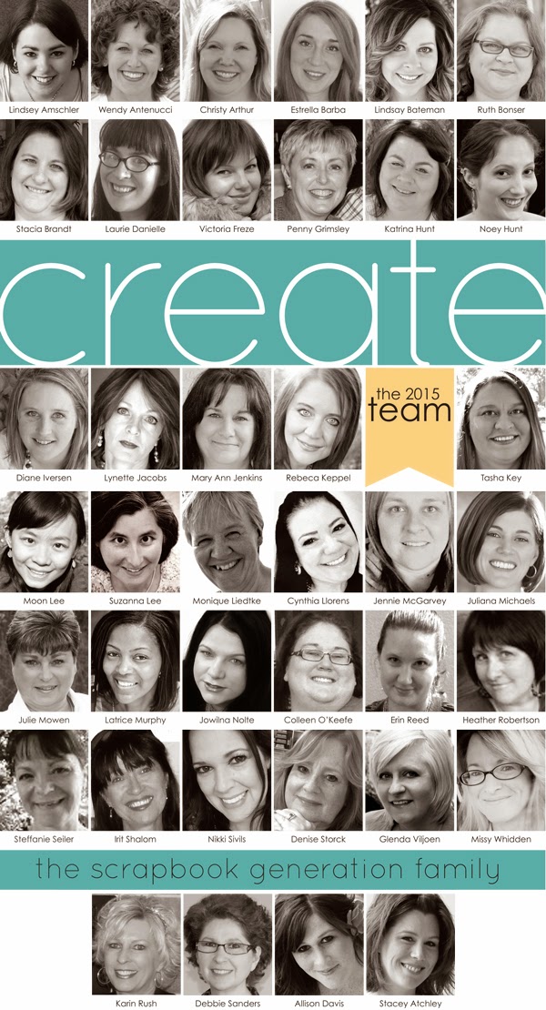
The good news is, the new CREATE magazine is here!

July's magazine is full of great ideas and wonderful articles! 
This month begins a three part series on creating your own kits
written by the very talented Janet (aka Cherrypicker).
A MUST read, in my opinion!

 I have a single page layout in this months color challenge.
Here's a sneak peek, check out page 146 - 147 for the full layout.

I also completed a second layout on page 168 using this months card sketch.
Here is a preview of that layout.

Please check out CREATE on the Scrapbook Generation website.
As always, it's free and full of inspiration!

Look for more layouts from me later this week! 

Enjoy the magazine and  thanks for stopping by! :)


site design by designer blogs